A one-page website has one job: help a visitor decide, quickly, that you are the right choice, and make it effortless to contact you. Everything on the page should serve that job.
Here is what belongs on it, in roughly the order visitors look for it.
1. A headline that says what you do and where
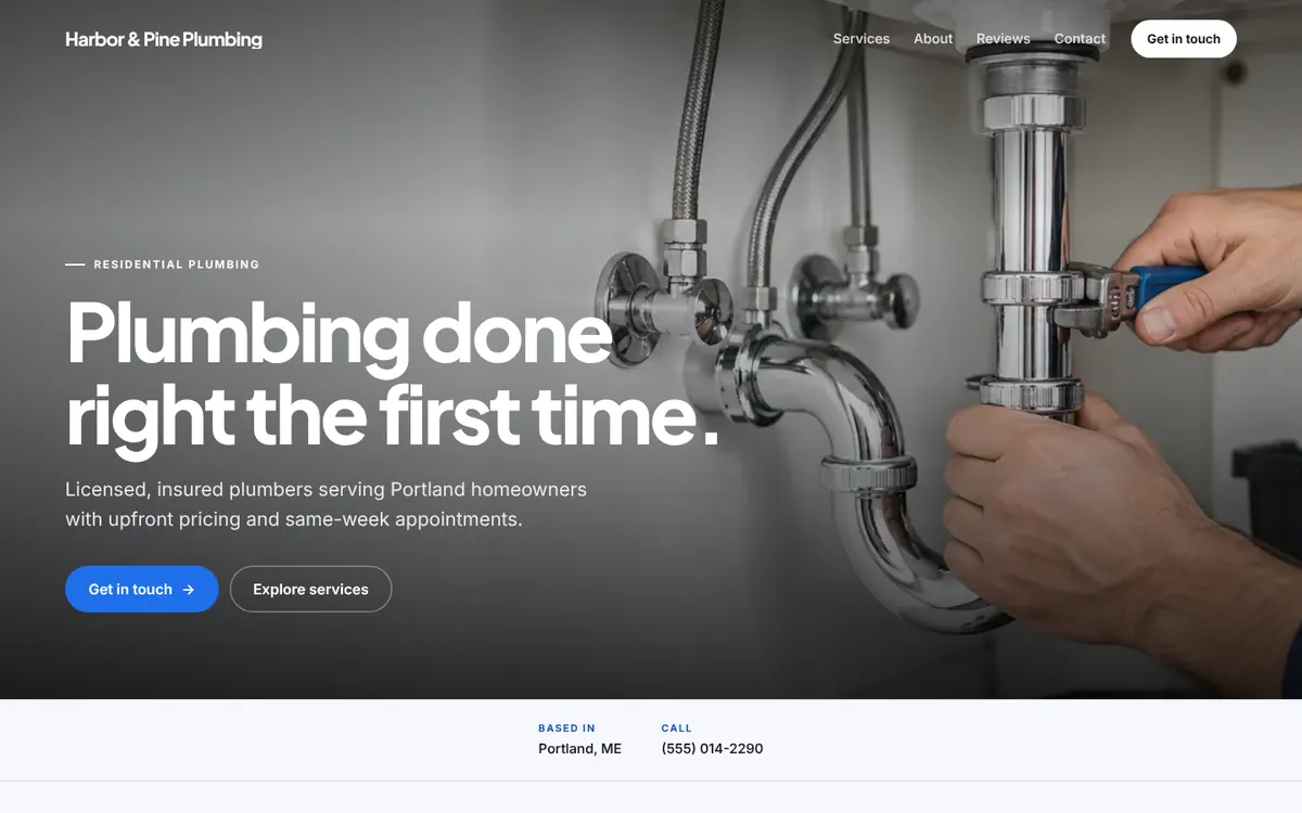
Visitors decide within seconds whether they are in the right place. “Welcome to our website” wastes that moment. “Licensed plumbers serving Portland homeowners” does not. Name the service, and the area if you serve one.
2. One clear call to action
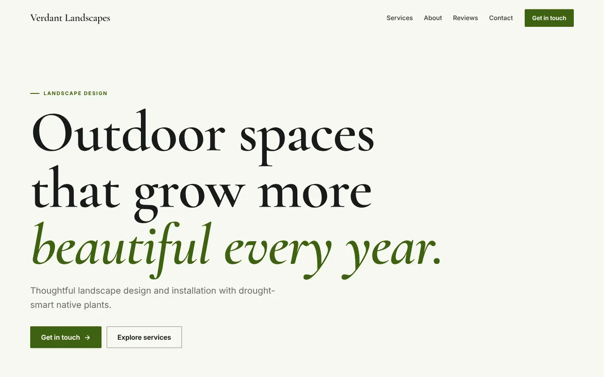
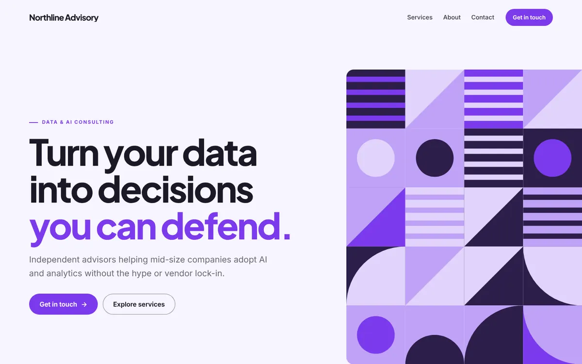
Decide the single most valuable thing a visitor can do: call, book, request a quote, or send a message. Put that button at the top and repeat it further down. A second, softer action, such as “See our services,” is fine. Five competing buttons are not.
3. Your services, in plain words
List what you offer the way customers would describe it. “Drain cleaning” beats “Comprehensive hydro-mechanical pipe solutions.” A short line under each service explaining who it is for or what is included goes a long way.
4. Proof that you are real and good
Trust is the main thing a small business website has to earn. Useful proof includes:
- Customer reviews with a first name and, if possible, a location
- Licenses, certifications, or insurance, where they apply to your trade
- Years in business or the number of jobs completed, if you can state it truthfully
- Photos of your real work, your team, or your premises
Never invent reviews or numbers. Real customers notice, and so can regulators.
5. A short “about” section
People buy from people. Two or three sentences about who you are, why you started, and what you care about make you memorable. Keep it about the customer as much as about you.
6. Contact details that work on a phone
Many visitors will find you on a phone. Make your phone number a tap-to-call link, your address a link to a map, and your booking link one tap away. Test it on your own phone before you publish.
7. Hours and service area
“Do they cover my town?” and “Are they open Saturday?” are two of the most common reasons people leave a site to look elsewhere. Answer both on the page.
8. A design that looks good on every screen
Your site should look intentional on a phone, a tablet, and a laptop. Text should be readable without zooming, and buttons large enough to tap. Search engines such as Google primarily look at the mobile version of a page, so a poor phone experience costs you twice.
9. The basics search engines read
Every page needs a descriptive title and a meta description. It should load fast, have descriptive image text (alt text), and include your business name, address, and phone number written as text, not baked into an image. Our local SEO guide covers this in more depth.
10. Nothing that slows the decision down
Pop-ups on arrival, auto-playing video, stock photos of handshakes, and long walls of text all get in the way. When in doubt, cut it.
Is one page really enough?
For many service businesses, consultants, coaches, and local shops, yes. A visitor needs to know who you are, what you do, why to trust you, and how to reach you. A well-built single page answers all four without making anyone hunt through menus. We compare the two approaches in one-page vs. multi-page websites.
Get every item on this list in minutes
Wehb.pro builds a one-page website around this structure: a clear headline, services, reviews, an about section, and a single call to action, all responsive on every screen. Describe your business, see real examples, and preview yours for free before deciding.